Why You Need A Bar
Think home bars are a bit passe? Well, read on to discover why they should be high on your priority list.
We get a lot of questions about how to incorporate hotel glamour into your home. Whether it's an ultimate master suite or a boutique guest room, it's all about finding a balance between beauty, comfort, and functionality. Home bars strike this balance perfectly. Posing the perfect place quench your thirst, oozing cool and anchoring the room.
We are firm believers that you should only have items you love in your home; after all - growing numbers of people are spending more time at home than ever before! However, if not well designed, your home can quickly become a space for frustration, clutter and disorder, making it the opposite of a relaxing, practical and calming space.
Remember all items in this post have links if you want to shop
WET OR DRY BAR?
______
That's right - there are two different types of bar! Both have their uses in a home, with one easier to retrofit than the other. Despite the names, they are both used for beverages.
Put simply a wet bar means it has plumbing. This is usually for a sink but can include other things such as an ice maker. A dry bar has no plumbing, making it easier to add to your home.
In our latest design project, we have been working on two different bars (yes that's right, two bars in one house!) to break down the basics of what works well in each space. Scroll through the photos below to find some inspiration and get an inside look into our process!
Dry Bar - living room/cinema
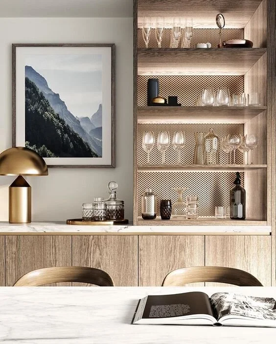
This is considered a dry bar owing to the lack of sink (drinks still served here!) The bar has been seamlessly integrated into the sideboard and offers a vertical focal point. The neutral, yet luxurious colour palette holds it own in the space with the under shelf lighting working all sorts of magic. The lack of cabinet handless is what makes this a strong look - instead of distracting the viewers, we get to enjoy the lines of the cabinets and countertop and the texture created by the metal mesh at the back.
For our first look, we started with a luxe neutral feel. With cool, neutral tones, and a hint of brushed gold, it is the perfect combination to pull colors from to use throughout the rest of the room iwhtout dominating the space.
Design detail: When designing the right bar for your home, make sure you think about materials. It’s good to have a little variety and the perforated metal does this wonderfully. Likewise, the Calatta marble in the image to the right adds a texture detail without upsetting the rhythm and colour palette.
Textured and brushed metals feels luxurious and bespoke
Forming the end of the kitchen and crossing in to the dining area, this understated dry bar provides an extra space to style with your favourite ornaments. When not in use, the doors that are neatly hidden in side pockets can be closed to complete the run of units.
This bar is to be installed in a public area. For the Courtyard House project, it will be an open-plan kitchen-dining-living space, with the living room closing off to be a cinema.
We decided early on that a dry bar would be the perfect addition. From a functional perspective, it allows drinks and other items to be stored and used during screenings without needing to change the lighting, open doors or leave the room.
Thinking about ambient lighting is the key to ensure users can see what they are doing, without glare for the screen.
The example below showcases a small bar within a cinema room. Mood lighting adds atmosphere without detracting from the movie experience. When fully lit during the day, the bar adds a focal point.
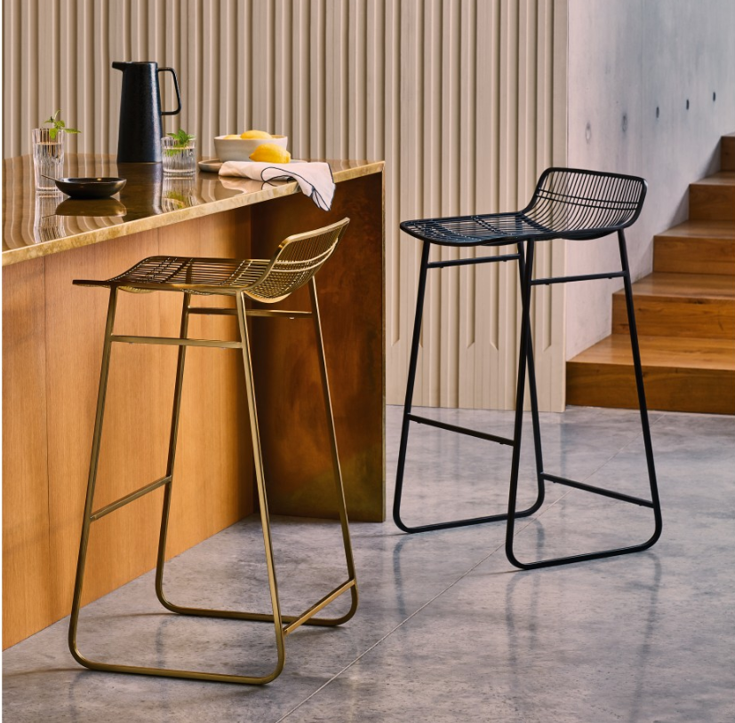
Why not go the whole hog and add a counter with some stools for the ultimate entertainment space.
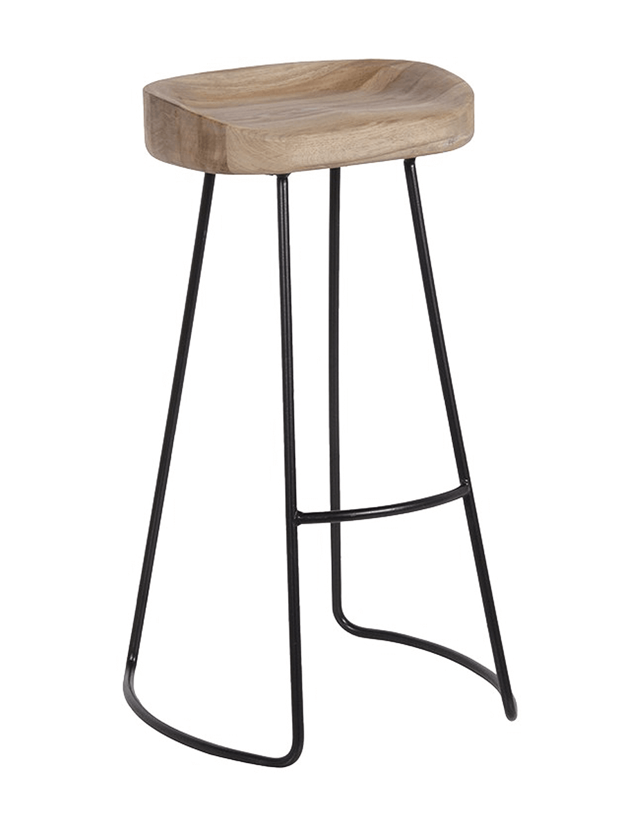
Accessorizing is the key and choosing beautiful barware can make or break your bar. These accessories are not only beautiful to display but will help your bar to function as it should. For help picking the perfect bar or counter stools check out this post.
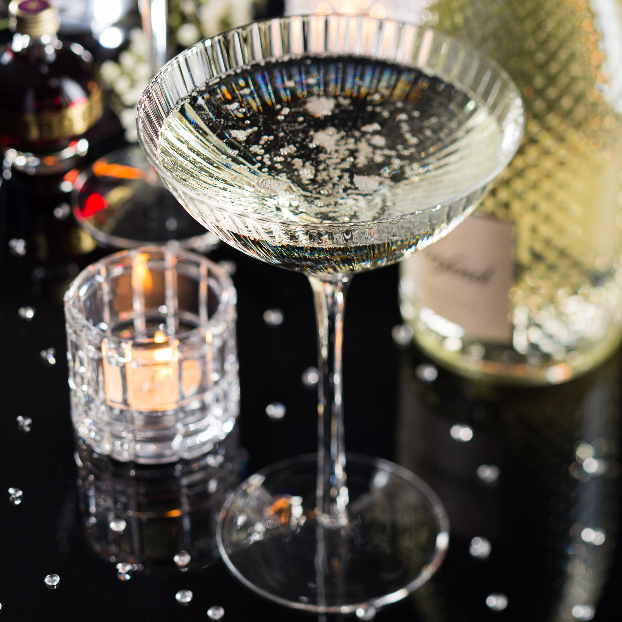
"I have these champagne coupe glasses in my own home. I searched for ages to find glasses that will go in the dishwasher and won’t break the bank. They can be stacked too, which Scott and I do for some special occasions, but are also beautiful to look at.." - Beck
Mirrored rear wall fills the bar with light without actually adding any. Very clever for moody spaces and where you are using dark cabinetry.
Design detail: Remember to allocate enough space for the depth of a base unit (that’s what you use in your kitchen) at 600mm. This is a little extra than the unit’s size to allow for supplies (that’s drainage, plumbing and electrics) to run behind them and out of sight. You can of course opt for different size doors and these usually go up and down 100mm at a time. We’d advise having door smaller than 300mm as the cabinets get quite narrow and are not particularly useful at this size. Instead, consider having a wine rack or open shelving.
Wet Bar - Master Suite
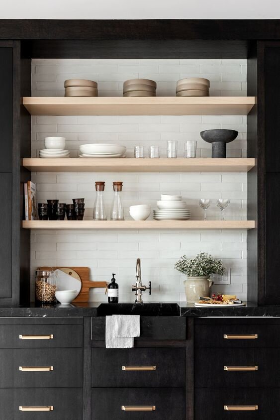
Dark and moody with honest materials balances this wet bar and makes it still look homely.
In look number two, we’re looking for a wet bar with added functionality for use in a master suite.
A glass front chiller adds functionality.
Thinking about the intended location of the master suite, the bar’s design will need to be simple and soft, as the bedroom is a place to relax.
Using a wet bar for a master suite is quite simply a genius stroke, and something you’ll see when staying at a nice hotel. The bar enables you to make a drink in the night or a coffee in the morning. For added function, you can incorporate a fridge/chiller, ice maker and glass washer. Ultimately it comes down to what are using the bar for and how often will you use it?
We’re particularly keen on these for family households. They double up as a bottle making station for when there’s a newborn about the house or a cocktail bar for when mum and dad want to escape the teenagers for some R&R.
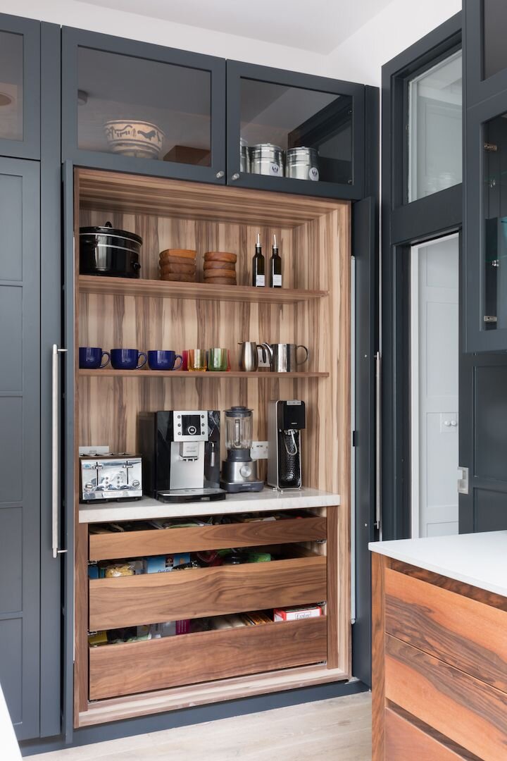
A bar doubles up as a coffee/breakfast station here.
"As silly as it sounds, I think combinations of wood and metal set the tone for the entire space you design. In the first look, we used very light, tonal colors. In this look, we went with higher contrast, and it gives an entirely different effect." - Beck
Mid-century styling with walnut doors and a taupe stone backsplash look great together. Barware items become decoration as they are carefully curated and finished in polished gold. →
Design detail: The bar's aperture is subtly emphasised by using the same stone as the countertop and shelves to frame the opening. This adds a classy touch and looks seamless. You could use a bolder colour if you want to make a statement. In this instance, where the bar is between two partitions, the neutral colour works well.
Symmetry works well in small spaces and doesn’t always mean everything has to be the same. Think about grouping two cabinet sizes together to make things interesting. Earlier in this post, we talked about cabinet depths being 600mm. 600mm is also the smallest door size you should look for with a wet bar. Any narrower and the sink might not fit! This is also the case if you’re thinking about having a fridge.
To see more about this project you can find the Courtyard House here.
Sources, from Top to Bottom:
Title Image: via our Pinterest board
Bar Images: All via our Pinterest board
Fluted Coupe Glass: Utopia Hayworth coupe glass by Utopia from Drinkstuff
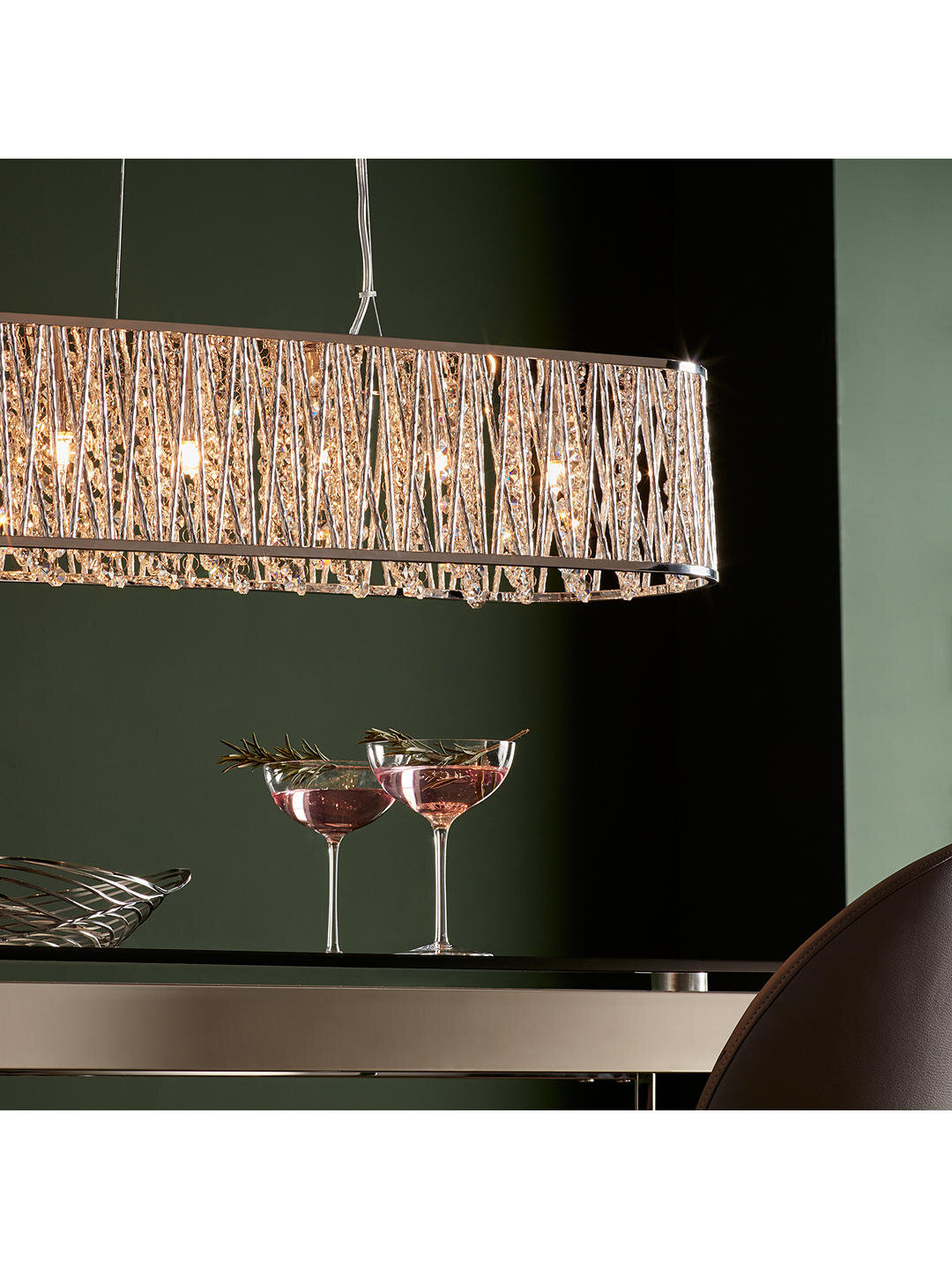
Bar Light: Emilia jazzy diner bar ceiling light by John Lewis
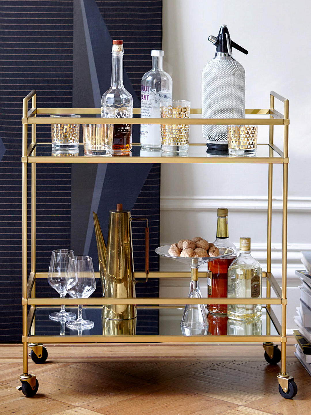
Gold Bar Trolley: Terrace bar cart by West Elm via John Lewis
Gold Bar Stool: Tabitha gold and wire metal finish bar stool by Habitat
Wooden Bar Stool: Weathered oak and metal counter Stool by Cox and Cox
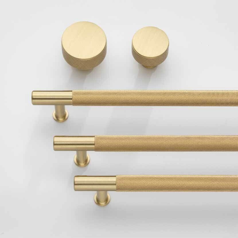
Brass Handles: Jovi knurled brass handles from Made
